Landing pages are a vital component of any good digital marketing strategy. Having a good understanding of their purpose and critical components can help boost conversion rates and guarantee the success of your next digital marketing campaign. So in this beginner's guide to landing pages, we're breaking down everything you need to know about these essential web pages before you start creating your landing page.
What Is A Landing Page?
So, what is a landing page exactly? While many marketing professionals assume it to be any page a visitor lands on after clicking an advertisement, that's not the whole story.
A landing page is a standalone web page independent of your site's navigation designed to promote to your target audience. Its sole purpose is to entice landing page visitors to take a specific action, such as joining an email list, purchasing a subscription, or downloading something. An effective landing page content is informative, persuasive, and engaging.
They're commonly used for ads on search engines, social media platforms, emails, and other lucrative digital marketing channels. Ideally, every promotion should have its specific landing page to increase relevance and produce accurate metrics.
Here are a few statistics that show just how valuable of an asset landing pages can be:
Across all industries, the average conversion rate for landing pages is 9.7%.
The highest conversion rates occur when companies ask for as little personal information as possible. An Omnisend study found conversion rates halved when users were required to input their birth dates and genders in addition to a first name and email.
Including content information on your landing page can increase sign-up rates by up to 9%, according to a Neil Patel study.
Types Of Landing Pages
There are eight standard landing pages that every digital marketing professional should be familiar with. Let's examine them in detail to understand how to maximize the potential of each type so you can create your landing pages.
Splash Pages
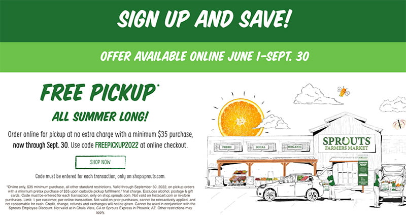
Splash pages are landing pages that precede other pages on your site, most often your homepage. These transitional pages may introduce your site or its content, ask users their language preference, offer a disclaimer, or call attention to a current offer. Unlike other landing pages, they aren't meant for lead generation; use them to make announcements and provide practical information that improves the user's experience on your site.
As the first touchpoint with your brand, it's crucial that your splash page transitions seamlessly into the site content that follows. Effective splash pages are highly visual, with little copy and a large hero image that takes up most or all of the screen.
Squeeze Pages
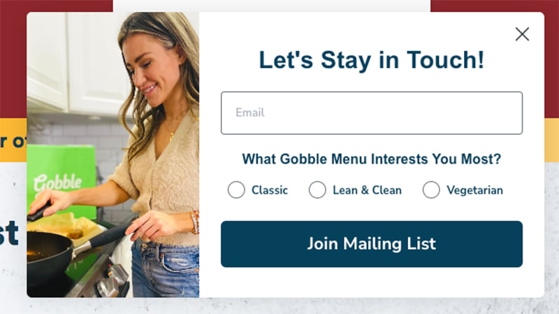
As the name suggests, Squeeze pages help "squeeze" the user through the top of your marketing funnel. These short-form targeted landing pages are often pop-ups designed to capture users' emails.
An effective squeeze page offers users something in return for their information. Visually, it should be simple, with fewer images and more miniature copy than your other landing pages. With that said, your squeeze landing page should still include the following elements:
An exit button allows users to exit the squeeze page without providing any information.
A link to your privacy policy lets users see exactly how your company will share their data.
A persuasive headline should highlight the value of providing their email or performing the desired task.
Short, simple copy providing additional information.
A short form for users to input their email addresses and personal information.
A submit button with a straightforward call-to-action.
Lead Capture Pages
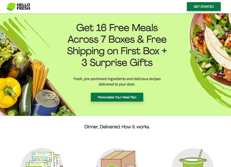
Lead capture pages— lead generation landing pages— are the most well-known and widely used type of landing page. They're typically used in the middle stages of the marketing funnel to capture leads through a form. The length and fields of a lead capture form vary. While some ask for just your email, others ask for additional information such as your name or geographic location.
But an effective lead generation landing page includes more than just a form. It has engaging short-form copy and strong visuals that are cohesive with the specific promotion and your brand overall. Most importantly, the landing page offers users something, such as a promo code or access to an exclusive video.
Sales Pages
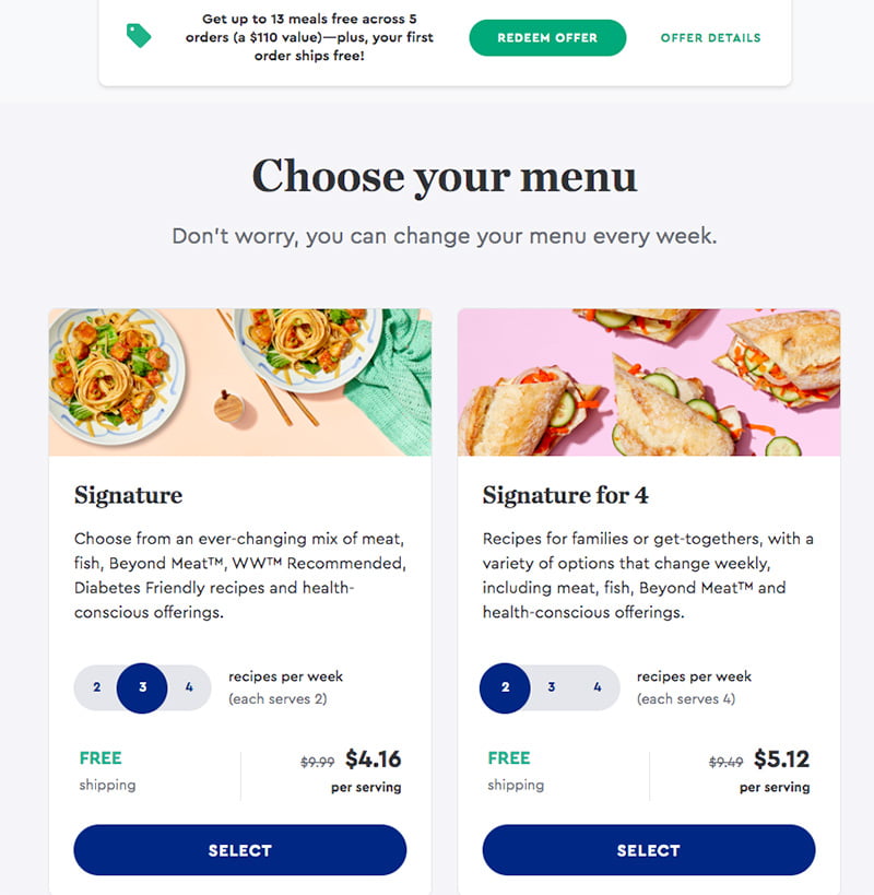
Sales pages are notoriously tough to design. Positioned at the bottom of the marketing funnel, their sole purpose is to persuade users to make a purchase. And as any experienced marketer knows, it's much harder to convince users to spend money than to share their email.
An effective sales page highlights the value of your product or service and additional information about it and your brand. They're often lengthier than other landing pages and click through landing pages, as users typically require more information before making a purchase.
Thank You Pages
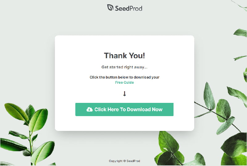
Thank you pages are designed to nurture leads and boost brand awareness. As the name suggests, they're used to thank your customers as they work their way down the marketing funnel. A good thank you page can create positive brand association and pave the way for repeat customers.
Users visit a thank you landing page after completing a form or making a purchase. They often have an upbeat tone, enticing new leads to engage with your business and reassuring customers of their recent purchase decision.
Unsubscribe Pages
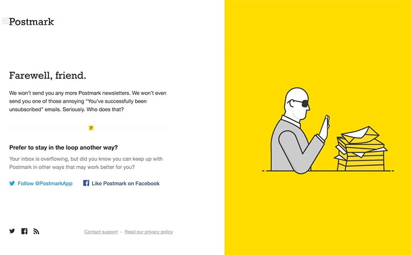
Users visit an unsubscribe page after clicking the unsubscribe link in an email. While some automatically unsubscribe the user upon clicking, most require additional confirmation. Don't think of unsubscribe pages as a throw-away; think of them as an opportunity to win potential customers back.
A successful unsubscribe page gives customers a chance to customize their email preferences, preventing them from entirely exiting your email list. It also highlights your brand's personality and reminds users what they'll miss out on if they stop receiving your email communications.
Referral Pages
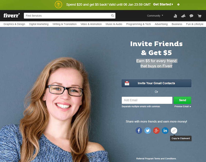
When done correctly, referral pages can be incredibly profitable. Their sole purpose is to encourage customers to make a referral by offering something in return. An effective referral page explains the rewards each party receives in return. For example, a company may offer a money-back or a discount on a future purchase for each user referred.
A referral landing page should include a value proposition in the headline, a clear incentives outline, and a simple submission form. Your call-to-action button should use positive, encouraging language such as Spread the Love or Earn Rewards.
404 Pages
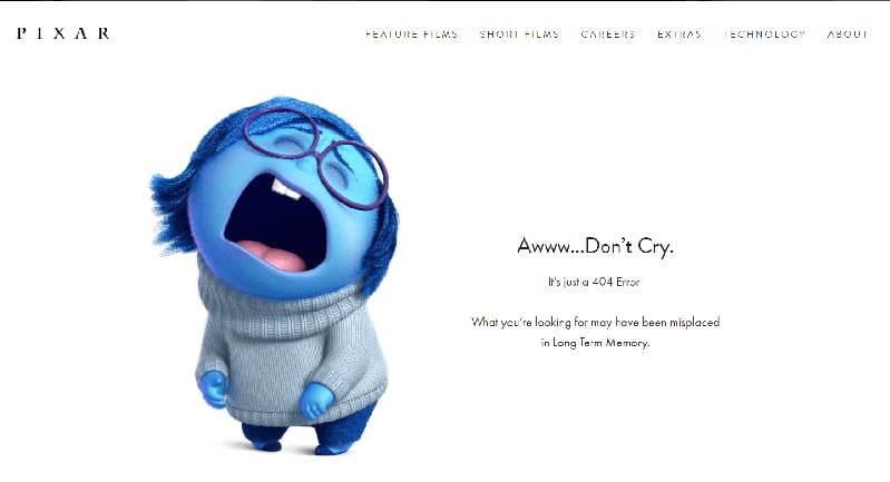
404 pages are more than just error pages. They'll turn a lost visitor into a loyal customer with the correct copy. They're an opportunity to put your brand voice on full display to keep your user's attention. A successful 404 page includes an error message and an alternative action for the user to take, such as returning to the home page.
Components of a Good Landing Page
Are you struggling to craft a high-converting landing page? You're certainly not alone. Landing pages are often cited as one of the biggest challenges for marketers, even those experienced with building web pages and writing ad copy. Depending on the size of your marketing budget, it may be worth hiring or consulting a digital marketing agency. They can help you run A/B testing to find your company's most cost-effective digital marketing strategy.
Here are the key components any good landing page includes:
- Contact Information— Whether it's a phone number, email, or even your social media handle, it's crucial to display your company's contact information on the page.
- Call to Action— The sole purpose of a landing page is to convince visitors to take a specific action. Position a solid call to action above the fold, providing visibility as much. Use bright colors and bold designs that instantly attract visitors' attention.
- Concise, Targeted Copy— Your landing page's content, visuals, and copy should be hyper-relevant to its link source. You only have a few seconds to capture a user's attention.
- Brand Voice & Visuals— No matter what type of landing page you're designing, it needs to stay cohesive with your brand identity. Users should be able to transition seamlessly from your landing pages to your homepage, about and contact pages, product pages, and other prominent pages on your site. Give users a taste of your company and what makes it unique.
- Key Content Above the Fold— Keep your landing pages short and sweet. Everything required to convert visitors should be kept above the fold, meaning it's visible on users' screens when they first land on the page.
What's The Difference Between A Homepage And A Landing Page?
The main difference between a landing page and any other page on your site is that a landing page is not connected to your site's navigation. Instead, it's reached through clicking on an advertisement or specified link.
Additionally, landing pages are designed solely to capture a user's email, change their email preferences, or convert visitors into paying customers. By contrast, your home page is a multipurpose hub connecting your site's various aspects while providing critical information about your company and its products or services.
How To Create Your Landing Page
When creating your landing page, landing page optimization is essential. This includes:
Competitors Research
Every site's best practice when creating landing pages is to check out your competitors. What headlines are they using? What is their writing style? What types of images are they using?
Attractive Headlines
Headlines are one of the essential pieces of your landing page, as they are more likely to read your CTA. Without a captivating headline, the site visitors will never see beyond just your landing page.
Concise Copy
Your landing page content should be short and sweet. It's rare for someone to want to spend time reading long and tedious paragraphs. Remember, you have approximately 8 seconds to engage them.
Eye-catching Images
Images are great tools to evoke an emotional response as the best ads sell a feeling. Think about what your readers want to feel and select an image that conveys your product or service that recreates that feeling.
Choose a clean, straightforward design to keep the reader concentrated on your copy and call to action.
A/B Testing
Your target audience preference is ever-changing, and so should your landing page. Try A/B testing to determine the best landing page for your marketing campaigns when in doubt.
Related Posts You Might Want To Read

