Crafting high-converting landing pages can pose a serious challenge, even for an experienced marketing professional like yourself. But with the help of this practical guide— and the support of PPC Mastermind's team of experienced designers, copywriters, and data analysts— you can create engaging landing pages that generate leads, convert visitors to customers, and achieve all your other marketing goals along the way.
What is a landing page?
Before we get ahead of ourselves, let's reexamine the definition of a landing page. These stand-alone web pages are where search engine users "land" after clicking on an ad or promotional link. Created specifically for digital marketing campaigns, they feature a slightly different design than traditional web pages.
Though landing pages serve a variety of purposes, there are two main categories almost all of them fall within:
- Lead Generation Landing Pages— Capture customer emails, phone numbers, or other contact information in exchange for something valuable, such as a promo code or free download.
- Click-Through Landing Pages— Redirect users to another page where they can complete your desired action, such as purchasing a product, scheduling a free consultation, or starting a free trial.
What makes a good landing page design?
While there's no magic formula for effective landing page design, there are a few key elements every good landing page includes. Before you start building landing pages, here are some things notes:
A Simple Landing Page Design
A good landing page serves a singular purpose. Stick with a simple design that directs users to complete your desired task. Lengthy copy and distracting visuals can easily cause a potential customer to click away.
True to Your Brand Identity
Visitors should have a cohesive experience from their first click on your site to their last. Your landing page design should stay on-brand with the rest of your website. Stay consistent with your color scheme and font choice.
An Enticing Headline
You only have a few seconds to catch visitors' attention. It's important to hook visitors with an enticing headline that communicates the purpose of the landing page. Reiterate your chosen keyword and draw users in with attention-grabbing language. Don't shy away from catchy words like 'free.'
An Eye-Catching CTA Button
CTA buttons are one of the most important elements of landing page design. Try to keep them "above the fold"— marketing speaks for the elements visible from the moment a visitor enters the page before they start to scroll. Then strategically place them throughout the entire page.
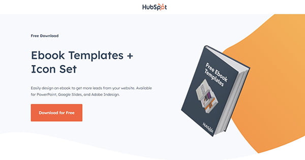
Image Source: HubSpot
Concise Copy
The key to a great landing page is to keep things short and sweet. Link relevant words and phrases to more informational pages on your site, such as your Contact or About Page. This allows interested users to keep exploring your site without overwhelming them with too much copy.
Many landing pages utilize bullet points to communicate key points without swamping users with information. These phrases or short sentences are easier for users to scan than paragraph after paragraph of copy.
Contact Information
For many visitors, this click is their first interaction with your business. Adding your contact information to your landing page assures them you're a legitimate business. It also gives interested leads the ability to reach out with additional questions. Be sure to add your social media accounts, in addition to the usual email address, physical address, and phone number.
Fast Page Loading Speed
Slow loading pages can ruin even the best landing page design. Search engine users are notoriously impatient, so every second counts. Maintain high click-through and conversion rates by optimizing loading speed. An easy way to do this is by reducing image sizes and getting rid of unnecessary scripts and plug-ins.
Mobile Responsive Design
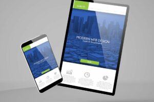
Creating landing pages for mobile devices versus desktops can be very different. With many visitors coming from mobile, creating a mobile-friendly landing page is a must to convert your visitors and provide a better user experience.
Examples of Effective Landing Pages in 2022
Now that you understand the elements of good landing page design, let's take a look at a few real-world examples to use as design inspiration for your landing pages:
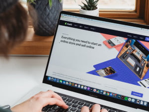
Shopify's Free Trial CTA Button
Successful landing pages feature a clear call-to-action button. This is where you'll tell your visitors exactly what action you'd like them to complete or what they'll get in return. Are you offering a free trial? Sharing a discount code? Make what you're offering incredibly clear and highlight all the perks.
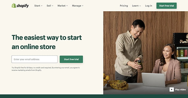
Image Source: Shopify
This Shopify landing page tells users exactly what they're getting in return for their contact information. It features a single field form for potential customers to input their email. While some users will undoubtedly wander off during the rest of the sign-up process, this ensures the company has their contact information from the very first click.
Curology's Clean Design & Compelling Visuals
Depending on the products and services your company offers, it may be worth including customer testimonials or product reviews. This Curology landing page seamlessly integrates before and after photos that highlight the efficacy of their products. It stays true to the brand's minimalist aesthetic and shows off their simple-but-effective packaging. The headline, copy, and CTA button to the left communicate key points without weighing down the page.
Uber Eats' Strong Visuals Above the Fold
You know how the old saying goes; a picture is worth a thousand words. Placing a strong visual above the fold confirms visitors are in the right place without overwhelming them with too much copy. This Uber Eats landing page features a single headline, simple form, and a mouth-watering photo that makes users excited to use their food delivery service.
Scroll down, and you'll find key selling points tailored towards different target customers. Each one contains a link to another webpage with additional information about the services they offer. Adding interactive elements—such as Uber Eats' practical map of participating restaurants— is an excellent way to keep customers engaged as they scroll.
ClassPass' Informative Copy & Visuals
One of the most challenging aspects of landing page design is choosing what information to include and what to leave out. This informative ClassPass landing page packs tons of information into a single headline and a few lines of compelling copy.
Instead of listing out the different workouts they offer, they let the visuals in the background do the talking. A straightforward sign-up button reels in strong leads by offering a free trial. A subtler CTA button below directs visitors to a page where they can explore more classes and appointments, offering additional opportunities to generate leads.
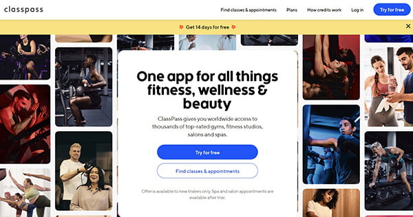
Image Source: ClassPass
Care/Of's Straightforward Options
Cohesion is crucial to any good landing page. The fonts, language, and visuals should all stay true to your brand identity, providing visitors with a seamless transition after every click. This aesthetically-pleasing landing page from Care/Of, a direct-to-consumer brand offering personalized vitamins and supplements, shows how it should be done.
Underneath the main call-to-action button is another link for users to explore. Those who aren't interested in taking the quiz can jump straight into browsing the brand's products. The contemporary visuals show off the brand's stylish packaging and reflect the lifestyle of its target customer.
Imperfect Foods' Simple Message
Nothing hooks visitors like the word 'free.' But that's only part of what makes Imperfect Foods' landing page design so effective. This straightforward landing page centers around a simple, succinct headline that tells first-time visitors exactly what the company does. In just a few words, it explains that their service is sustainable, affordable, and convenient. A postcard-inspired graphic appeals to their target audience and informs customers of their eye catching packaging and low emissions deliveries.
SKIMS' Email Sign-Up Splash Page
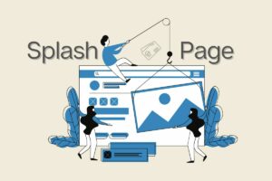
Splash pages— an introductory landing page or pop-up— are an excellent way to generate leads. When users first click on SKIMS' site, they're greeted by an email sign-up form in a pop-up overlay instead of a full-screen page. This assures visitors they've come to the right web page and creates an instant interaction between customer and brand.
This SKIMS landing page design closely follows the clothing brand's color scheme, font choice, and overall aesthetic. Its short, persuasive copy conveys a sense of exclusivity and desirability to first-time visitors to the site. Another key design element is the 'No Thanks' button that allows uninterested users to enter the site without sharing any contact information.
Barefoot Wine's Age Verification Splash Page
Age verification splash pages are a must for companies with age-sensitive products or website content. Though not legally required, alcohol, tobacco, and marijuana companies are required to "self-regulate" their sites with age verification technology. Unlike other splash pages, they don't offer users the option of entering the site without inputting their personal information. While they can't prevent all underage users from entering the site, they can help deter sales of alcohol to minors.
Barefoot Wines' age verification landing page utilizes witty copy and a super simple design. Its straightforward headline and compelling sub-heading clearly state what information they're looking for and why they need it. The wordy legal statement they're required to include is placed at the bottom in a small, grey font that doesn't feel overly distracting.
Related Posts You Might Want To Read

