Ask any experienced digital marketing professional, and they'll tell you that first impressions are everything. That's why compelling splash pages (sometimes called splash screens) are worth focusing your marketing efforts on.
These introductory landing pages act as users' first touchpoint with your business, making for a make-or-break moment between you and your brand. An effective splash page entices users to proceed to your site, while a sub-par splash screen may cause them to click away to your competitor's site.
This guide to splash pages breaks down everything you need to know about this lucrative digital marketing tool. We'll offer helpful tips on creating an effective landing page and examine a few splash page examples along the way.
What Is A Splash Page?
A splash page is a standalone page that precedes the rest of your website. Think of it as a virtual business card or an ID check at the door.
This simple landing page provides site visitors with the essential information they'll need before interacting with your brand. Common uses for landing pages include age verification, language preferences, and email sign-up pages.
How To Create An Effective Splash Page
Are you struggling to craft the perfect splash page? You're not alone. Marketers often cite 'making effective landing pages' as one of their biggest challenges. Bel0w, we've rounded up a few helpful tips to help you create engaging splash pages:
Stick with Simple Splash Page Design
Keep things simple. A typical splash page contains minimal copy and a background image with a link that takes visitors to the main site. Too much copy can overwhelm or confuse users, causing them to turn away before they fully enter your site. Though the page's components will vary based on content, they loosely follow the same design and content direction as a post-click landing page. Here are three key elements you'll want to include:
An informative message
A compelling call-to-action
An eye-catching image or graphic
A bold exit link
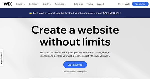
Image Source: Wix
Try a Pop-Up or Overlay
A pop-up or overlay contains all the same elements of a traditional splash page while offering users a glimpse of your site. This sneak peek affirms users they've come to the correct website and excites them about their next click.
Be sure to use a mobile-responsive overlay that works on all screens. You'll also want to include an exit button allowing users to enter your site without inputting personal information. Otherwise, they'll return to the search engines they came from.
Take a look at Tom Ford's mobile site as an example. With more than half of all web page views coming from mobile, not having a mobile-optimized overlay or splash page means you are missing out on potential customers.
Responsive Template
Using a responsive design that adjusts to any screen size is crucial. This ensures that each user has an optimal viewing experience, regardless of their device. A third-party designer can help you write the correct code.
Monitor Analytics
Test different copy, CTAs, and splash page designs, and compare the results to find the best one. While the metrics you measure will vary based on your goals, consider tracking the following:
Landing page views
Sessions by source
Average time spent on page
Bounce rate
Pages per session
Form submissions
Click-through-rate
What's The Difference Between A Splash Page And A Landing Page?
Though splash pages and landing pages are incredibly similar, they're not the same thing. To help you understand the nuances, let's examine their similarities and differences.
Both splash pages and landing pages are standalone pages that exist separately from your site's navigation. But unlike a landing page, the primary purpose of a splash page is to inform visitors, not to convert them. While splash pages focus on data extraction and audience screening, landing pages concentrate on lead generation and conversions.
Splash Page Examples
Splash pages can serve a wide range of purposes. The best way to understand them is to look at a few real-world splash page examples.
Age Verification

Brands selling alcohol, tobacco, or recreational marijuana often use splash pages for age verification. The Federal Trade Commission states companies should "self-regulate" using age disclaimer technologies to prevent underage alcohol purchases and consumption. While age verification splash pages are not required by federal law, many alcoholic brand websites use this to help deter underage visitors from viewing content intended for users 21 and older.
The design of these age verification landing pages differs slightly from other splash pages. Unlike pop-up pages boasting a promotional announcement or newsletter sign-up form, there's no exit link. This forces users to verify their date of birth before entering your company's main site. Stick with minimal copy, on-brand visuals, and a straightforward call to action.
This aesthetically-pleasing page from Leafly is an excellent example of an age verification splash page. It contains minimal copy, relevant graphics, and a low-friction form. The handful of words on the page offers users a little insight into the purpose of the site they are entering.
Language Preferences
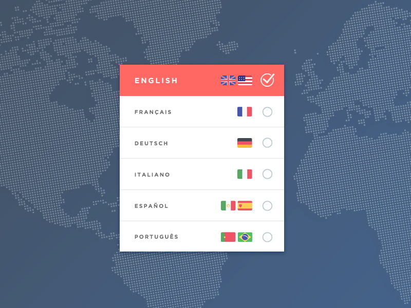
If your business has a global customer base, you may want to consider using a splash page to ask for their language preferences. Typically, these splash pages contain strong visuals and very little copy, and the imagery should provide users with insight into your products, services, or brand identity.
Advertise a Current Offer
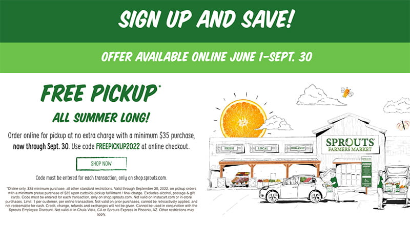
What better way to lure visitors into your site than to offer a discount on their first click? Share a promo code, highlight a current sale, or remind visitors about free shipping and returns. A digital marketing agency can help you A/B test to find the most profitable splash page for your current offer.
This Fashion Nova pop-up splash page example hooks users from their first click. The interactive scratch-off sticker creates an instant interaction between customer and brand, and it's satisfying, rewarding, and highly effective.
Collect Contact Information
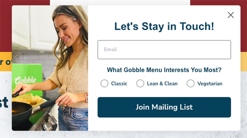
Splash pages can also be used to collect website visitors' contact information. These visually engaging pages should contain a sign-up form, an engaging CTA button, and a single message that reflects your brand personality and tells users precisely what you want them to do. You can also consider using overlays or pop-ups instead of an entirely separate splash page.
The key to creating a high-converting landing page is to offer users something in return. Here are a few standard email sign-up incentives:
Discount code
Email newsletter
Free download
Access to exclusive content
Entry into a contest or giveaway
Everlane's email sign-up page features the right balance of imagery, text, and entry fields. It tells users what benefits they'll get in return for sharing their email and gender preferences. Those who aren't interested in sharing their personal information can hit the 'No Thanks' exit link or classic X in the corner.
WiFi Login
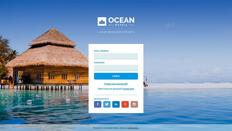
A splash page can also act as an entry point to your private WiFi network, and even a simple login screen can be an impactful touchpoint with your customers. Not to mention, it'll limit unintended users from joining your network. Like all splash pages, it should be straightforward, visually attractive, and cohesive with your brand identity.
WiFi splash pages are also called captive portals. The page's primary content should be a low-friction form that requires users to enter a password or perhaps just an accept button to confirm they're joining your network.
Privacy Policy

As the conversation around data rights grows, many companies have begun using splash pages to remind customers of their privacy policy. Similar to a language preference splash page, these practical pop-ups contain a button or simple form. This lets customers state their data sharing preferences, boosting customer trust before entering your site. It should include links to your privacy policy or cookies settings.
Tarte's privacy policy splash page takes up only a tiny portion of the screen. Giving users a sneak peek of the homepage confirms they've arrived at the right company's site. Two eye-catching CTA buttons provide clear, concise direction.
Promote an Upcoming Event
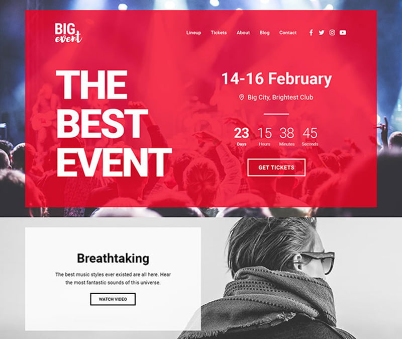
Splash pages can also be used to advertise an upcoming promotion or event. These informative messages benefit small businesses whose website visitors are more likely to attend. Like any good splash page, opt for a simple, straightforward design that's on-brand with the event. Stick to the basics (date, time, etc.), and provide a CTA button for interested visitors to learn more if they'd like.
Mobile-Friendly Splash Pages
As of February 2022, mobile devices account for over half of internet traffic. Ensure your splash page design works well across all devices or create mobile-only versions for smaller screens. To better serve mobile users, most businesses choose to display different splash pages on mobile devices than on traditional web browsers.
Effective mobile splash pages are straightforward. The more you ask users, the more likely they will hit the back button and return to the search engine results page. Stick to a mobile-optimized overlay with short, compelling copy and a form with no more than one field.
White Claw's specific landing page is an excellent example of a mobile-friendly splash page. In one cohesive design, it kills two birds with one stone by asking users their age and language preferences.

